
A YouTube thumbnail has one job: get chosen over the eleven other videos sitting next to it in someone’s feed. Most creators shoot that decision from the hip, cropping a random frame from the video itself. Google Gemini AI gives you a second option, turning one deliberately chosen photo into a set of thumbnail concepts built around a specific expression, composition, or mood, before you’ve uploaded anything.
The 12 prompts below are grouped by the job each thumbnail style actually does: reaction and emotion, tutorial and authority, competition and challenge, lifestyle and personal, and two faceless, graphic-first options for channels where a human face isn’t the right call. Each one is written as a full brief, lens, framing, lighting, and color grade, so Gemini has enough to work with instead of a vague one-line request.
What Actually Gets a Thumbnail Clicked
YouTube’s own guidance for creators is less about tricks and more about legibility and honesty: keep the composition simple, apply real design principles like the rule of thirds, and make sure the image actually represents what’s in the video. A thumbnail that overpromises gets clicked once and then works against you, since YouTube weighs what happens after the click too.
What separates a thumbnail that gets clicked from one that gets scrolled past:
- One clear subject or focal point, not three competing elements fighting for attention
- An expression or composition that reads correctly at the size it actually displays, a few centimeters wide on a phone
- Color contrast against the app’s white and dark-mode interfaces, not colors that blend into either
- A visual promise that matches what the video actually delivers, since a mismatch shows up in watch time, not just the click
- Consistent framing and color treatment across a channel’s thumbnails, so a returning viewer recognizes the channel before reading a single word
Getting Your Source Photo Ready
The source image matters more than the prompt wording. A sharp, well-lit photo with an expressive face or a clear action gives Gemini real detail to work from. A blurry or backlit phone photo doesn’t, no matter how detailed the prompt is.
Frame the subject to fill most of the shot and leave room at the edges for a title overlay if you plan to add one later. A cluttered background competes with the subject for the split second someone spends deciding whether to click. Natural window light or a simple studio setup will hold up better through AI enhancement than a photo shot under mixed indoor lighting, which tends to produce uneven color casts that carry through into the final result.
12 YouTube Thumbnail AI Photo Prompts
Reaction and Emotion Thumbnails
Prompt 1: Shocked Discovery. Subject using uploaded reference photo, close crop on face and shoulders, 85mm lens. Wide eyes, mouth open in genuine surprise, one hand lifted toward the jaw. Hard key light from one side with a dark falloff on the other, creating real dimension instead of flat front lighting. Background: solid deep red or blue, no texture, so nothing competes with the face. 16:9 crop, color graded for high saturation. Portrait Mode.

Prompt 2: Excited Reveal. Subject using uploaded reference photo, torso and face visible, 50mm lens. Pointing directly at camera, wide open smile, eyebrows raised, shoulders angled toward the lens rather than square to it. Warm key light from above and slightly forward. Background: soft gradient in a bright accent color with a subtle radial glow behind the subject’s head. Color grade pushes warm tones. Portrait Mode.
Prompt 3: Skeptical Look. Subject using uploaded reference photo, face and upper chest, 70mm lens. One eyebrow raised, mouth in a slight smirk, chin tilted down with eyes looking up at the lens. Cool, low-key lighting with hard shadow under the brow line. Background: near-black with a single thin rim light tracing the subject’s silhouette. Muted, desaturated color grade except for the subject’s skin tones. Portrait Mode.
These three work because the expression is doing all the communicating before anyone reads a word of the title. If the thumbnail needs to carry a business or professional angle instead of pure reaction, the same close-crop, single-light setup shows up in our AI headshot prompts for entrepreneurs and CEOs, just dialed toward credibility instead of shock.
Tutorial and Authority Thumbnails
Prompt 4: Before and After Split. Composition prompt, no single lens setting since this is a two-panel layout. Subject using uploaded reference photo appears on both halves of a vertical split frame, left side desaturated and slightly underexposed, right side bright and color-corrected. A thin vertical divider line separates the two. Neutral gray background on both sides so the contrast reads as the photo treatment, not the backdrop. Portrait Mode.
Prompt 5: Hands-On Demonstration. Subject using uploaded reference photo, medium shot at chest height, 35mm lens, hands visible mid-gesture as if pointing at something just off-frame to the left, where a title overlay would sit. Even, bright lighting with no harsh shadows, mimicking a well-lit desk or workshop setup. Background: softly blurred neutral interior, nothing sharp enough to distract. Natural color grade. Portrait Mode.
Prompt 6: Confident Expert. Subject using uploaded reference photo, chest-up shot, 85mm lens, arms crossed or one hand resting on the other arm, direct eye contact, neutral but assured expression. Soft key light with a subtle rim light on one shoulder for separation. Background: dark, softly textured, nothing branded or specific. Slightly cool, professional color grade. Portrait Mode.
That same soft key light and rim light combination is the backbone of our LinkedIn professional headshot Gemini prompts, which makes sense since a tutorial thumbnail and a headshot are both asking a viewer to trust the person on screen within a second or two.
Competition and Challenge Thumbnails
Prompt 7: Determined Setup. Subject using uploaded reference photo, upper body, 50mm lens, clenched jaw, focused stare directly at the lens, shoulders squared and slightly forward as if about to move. Hard directional light from a low angle for a slightly dramatic look. Background: dark with faint horizontal motion streaks, suggesting speed without literal motion blur on the subject. Portrait Mode.
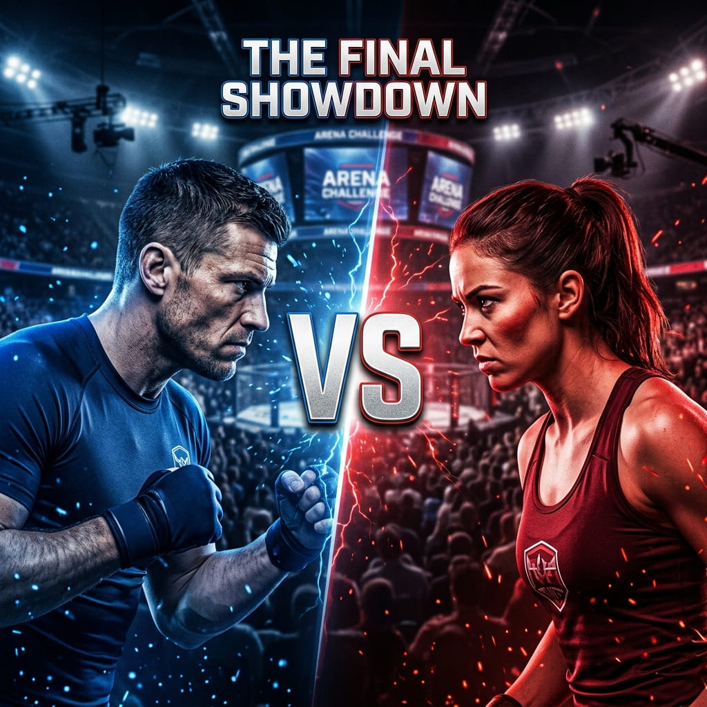
Prompt 8: Head to Head. Two-subject composition prompt if a second reference photo is available, or a single subject with a mirrored duplicate if not, 70mm lens, both figures facing each other at a slight angle with a visible gap between them for a versus-style graphic. Split lighting, warm tone on one side and cool tone on the other. Background: neutral dark gradient. Portrait Mode.
Lifestyle and Personal Thumbnails
Prompt 9: Genuine Conversation. Subject using uploaded reference photo, medium close shot, 50mm lens, relaxed half-smile, eyes slightly off-center from the lens as if mid-sentence rather than posing. Soft, warm natural light from one side. Background: softly blurred home or cafe setting with visible but out-of-focus detail. Natural, slightly warm color grade. Portrait Mode.
Prompt 10: Everyday Win. Subject using uploaded reference photo, chest-up, 85mm lens, relaxed genuine smile, slight upward chin tilt suggesting quiet confidence rather than a posed grin. Golden hour side lighting. Background: softly blurred outdoor or window-lit setting. Warm, slightly golden color grade. Portrait Mode.

Faceless and Graphic Thumbnails
Face-forward reaction shots work well for vlogs and reviews, but they’re the wrong call for a lot of finance, coding, and research-heavy content, where an exaggerated expression can undercut the credibility the video is trying to build. These last two are built around composition and typography space instead of an expression.
Prompt 11: Quote Card Layout. Composition prompt, no subject reference required. A single bold word or short phrase rendered as large, clean sans-serif typography, left-aligned and taking up roughly half the frame. Flat, solid background in one or two brand colors, no gradient. Right half of the frame left empty for a supporting graphic or product screenshot to be added separately. High-contrast color grade. 16:9 crop.
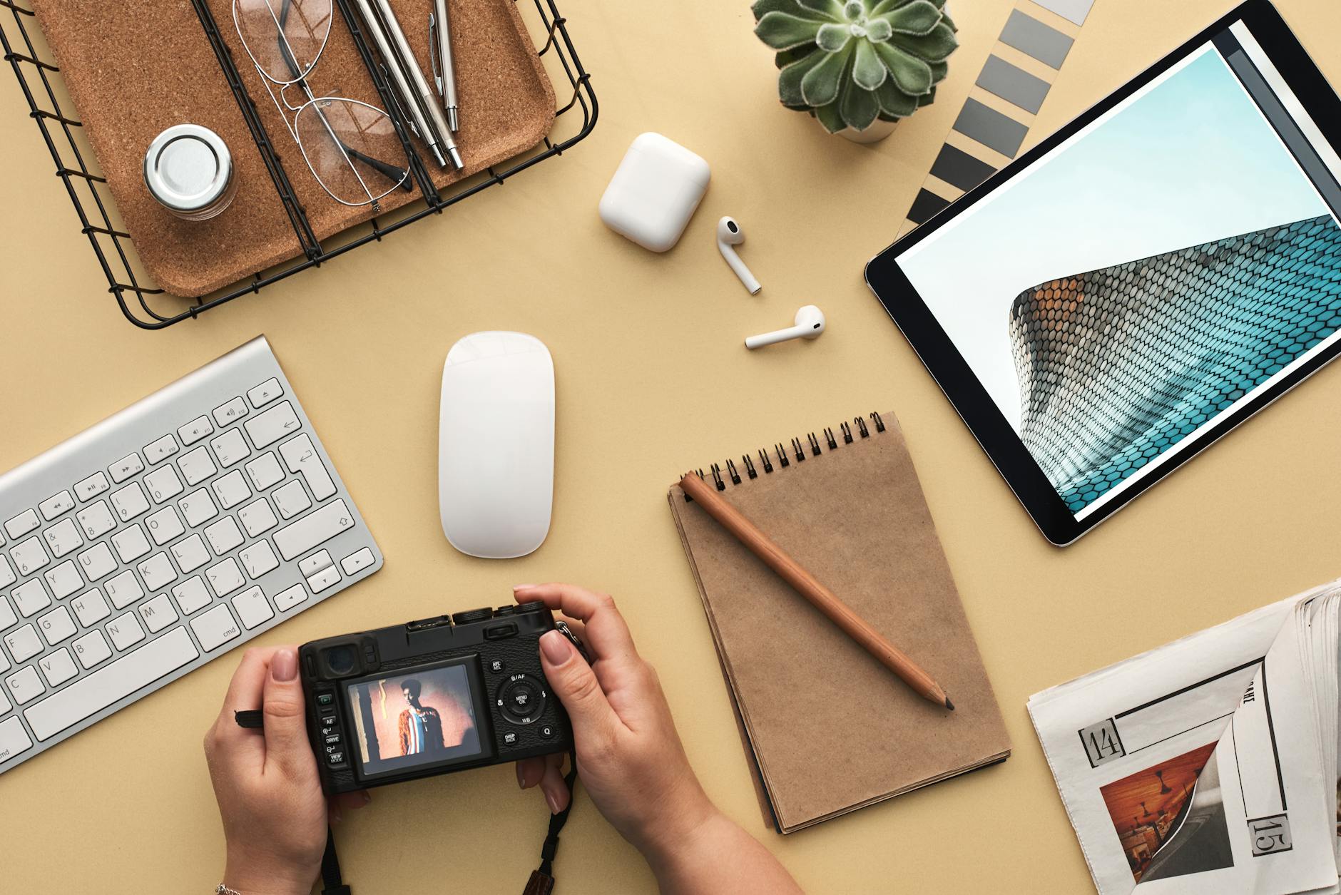
Prompt 12: Desk and Tools Flat-Lay. Overhead shot, 24mm lens, camera pointed straight down at a desk surface with a laptop, notebook, and one or two relevant tools or props arranged with clear negative space in one corner for a title overlay. Even, shadowless overhead lighting. Background: the desk surface itself, kept simple and uncluttered. Neutral, slightly cool color grade. Landscape orientation.
Making the Reaction Look Real
An exaggerated expression that still reads as genuine is harder to pull off than it looks. The difference usually comes down to the eyes: a forced smile shows almost entirely in the mouth, while a real one changes the whole upper face too. If the source photo’s eyes aren’t doing anything, no amount of AI enhancement on the mouth will fix it.
- Shoot the source photo reacting to something real, not posing for a camera with no context
- Take several versions of the same expression and pick the one where the eyes match the mouth
- Ask for the eyes specifically in the prompt, since that’s where a flat AI result usually shows first
- Stop short of the most extreme version of an expression, since the uncanny point is usually just past where it still reads as human
One Style, Adapted Across a Channel
A channel’s thumbnails should feel like the same person made all of them, even when the content varies week to week.
- Reaction shots for review and commentary videos, where the emotional read has to happen instantly
- Demonstration shots for tutorials, where the viewer needs to see this is the video that shows the actual steps
- Personal, conversational shots for vlogs and story-driven uploads
- Authority shots for explainer or educational content, where credibility matters more than shock
- Faceless, graphic shots for finance, coding, and data-heavy topics, where a calm, text-first thumbnail outperforms an exaggerated face
A channel built mostly around short-form spin-off content faces a related but different packaging problem, worth a separate look in our Gemini AI for Instagram Reels guide, since a vertical Reels cover and a horizontal YouTube thumbnail solve for different crop ratios and viewing contexts.
What YouTube Itself Says About This
None of this needs to be guesswork. YouTube’s own creator help documentation puts real numbers behind why thumbnails matter this much: 90% of the platform’s best-performing videos use a custom thumbnail rather than an auto-generated frame from the video itself. That same guidance is where the “keep it simple, make it accurate” advice above comes from directly, not from a marketing blog paraphrasing it.
It’s also worth knowing what a realistic bar looks like before assuming a thumbnail underperformed. Per YouTube’s own Help Center on impressions and click-through rate, half of all channels and videos on the platform sit somewhere between a 2% and 10% impressions CTR. A thumbnail landing in that range isn’t broken. The prompts above are there to push a specific video toward the higher end of that band, not to promise a number YouTube itself doesn’t guarantee.
Frequently Asked Questions
Do I need a different photo for every thumbnail style?
No. One well-lit source photo with a clear, expressive face works for most of the reaction, tutorial, and lifestyle prompts above. The two faceless prompts don’t need a personal photo at all, since they’re built around typography and composition instead.
What resolution should I upload for the best result?
1920×1080 or higher. YouTube itself recommends 1280×720 as the final thumbnail size, so starting well above that gives the AI enhancement step more detail to work with before it gets compressed down.
Will an AI-enhanced thumbnail look fake to viewers?
It will if the prompt asks for an expression the source photo isn’t already close to. Enhancing a real reaction reads as authentic. Manufacturing one from a neutral, flat photo usually doesn’t, no matter how detailed the lighting instructions are.
Should every video on a channel use the same thumbnail style?
The color palette and framing should stay consistent so viewers recognize the channel. The specific style, reaction, demonstration, faceless, should match what that particular video actually is, not be forced into one template regardless of content.
Is a face always better than a faceless, graphic thumbnail?
Not for every topic. A strong reaction face outperforms in reviews and commentary. For finance, coding, and research content, a clean text-and-graphic thumbnail often reads as more credible than an exaggerated expression, which is why prompts 11 and 12 above skip the face entirely.